John Cena is a man of many talents, and throughout the course of his time in WWE, he's been a man of many colors. Today, we want to take a look at some of the best color schemes that have been worn by the 16-time world champion over the years—because sometimes, it's important to look on the bright side of life.
Disclaimer: We're well aware of the fact that we're going to be leaving out some fan favorites here, but all of the looks we're about to list have played an important role in the history of this oh-so-complex character.
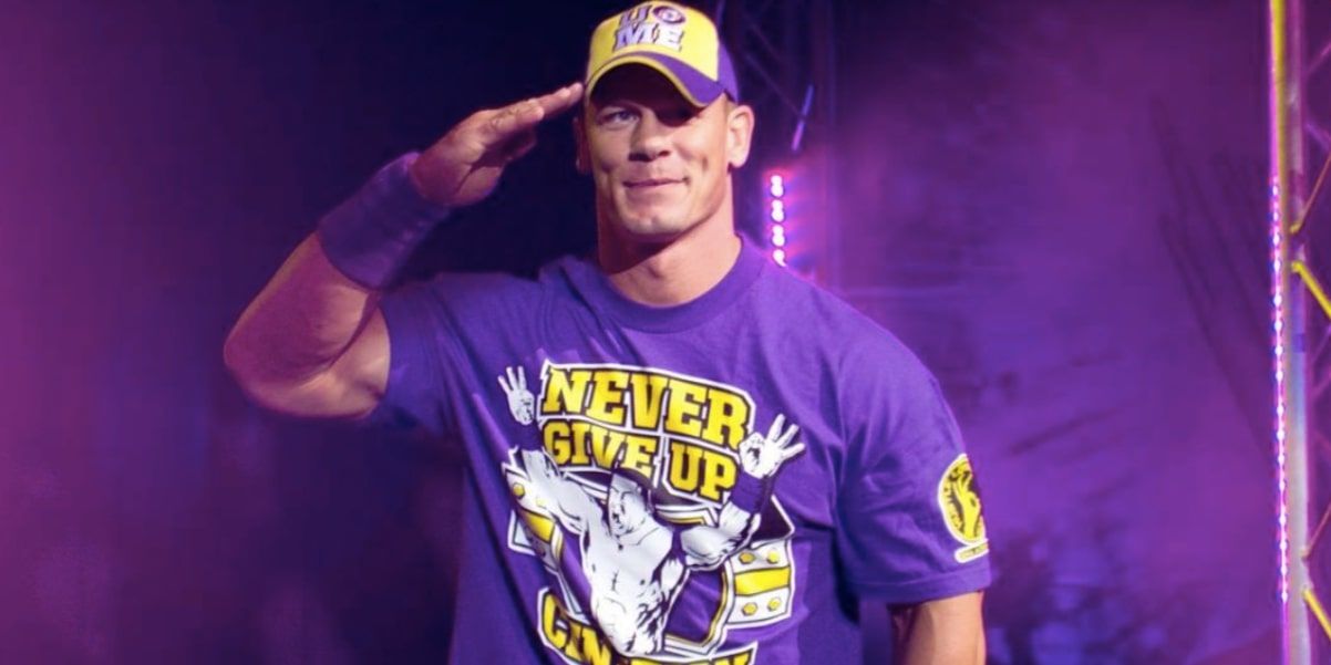
10 Purple
It made him look like Barney the Dinosaur and The Rock knew that, therefore kickstarting the Fruity Pebbles trend that never seemed to fully leave Cena throughout the course of his career.
It was a look that catered towards his younger fans and as you’re soon about to learn, we consider that to be an issue with many of these shirts. Why? Because people often associate that with ‘PG Cena’, despite the fact he had so many more great moments in this shirt that aren’t really talked about. It’s a shame.
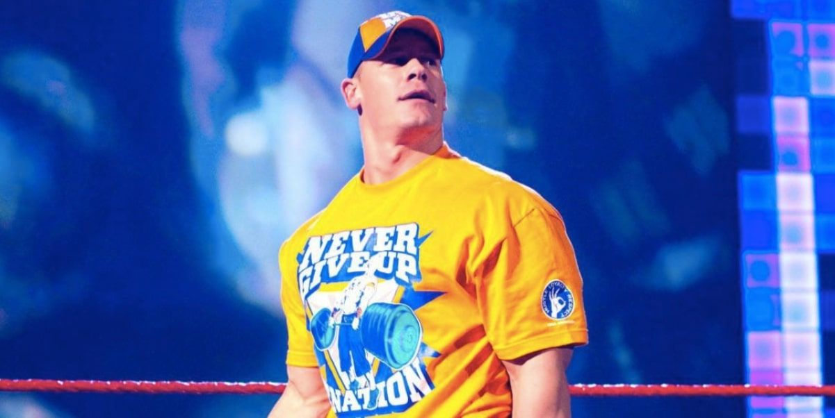
9 Orange
It was a slightly better look but we don’t exactly associate this with being Cena’s finest hour. It was before The Rock and after, well, most of his better feuds, and he just didn’t really seem to be all too invested in the work that he was doing.
It seemed like the shirt was attached to the bad material that was being written for him, and while some will claim that it was Cena who came up with a lot of his promos at the time, we just cannot bring ourselves to believe that.
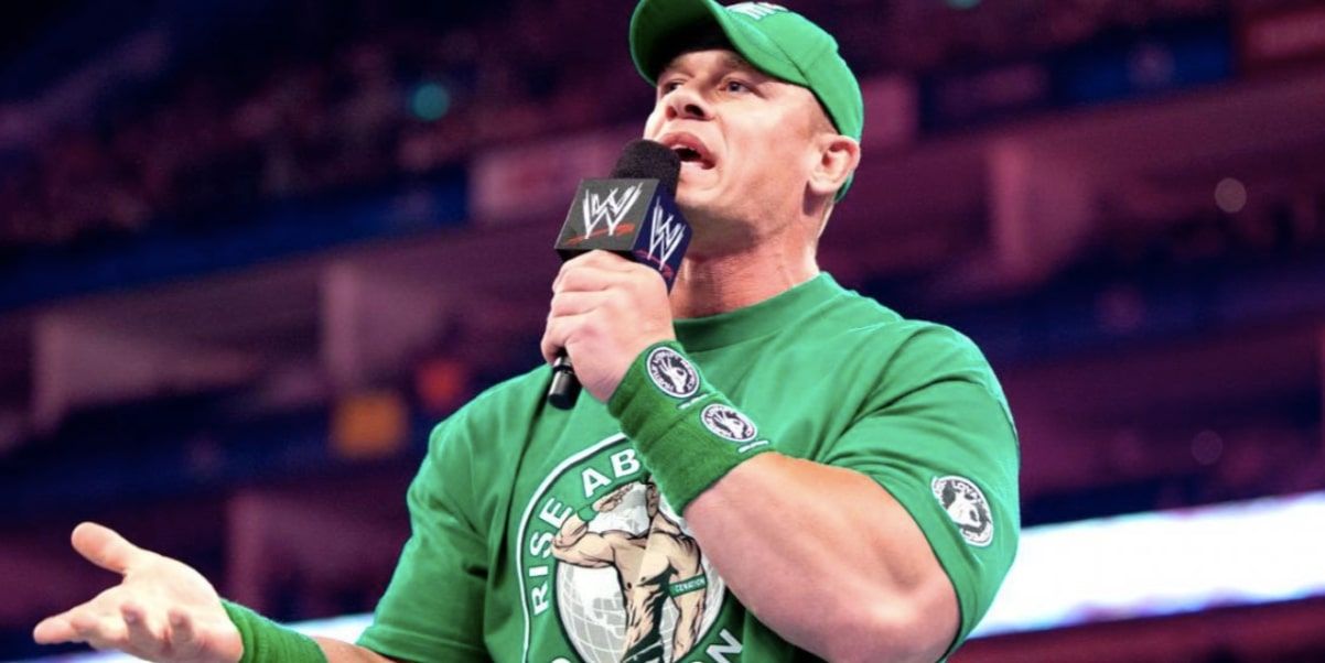
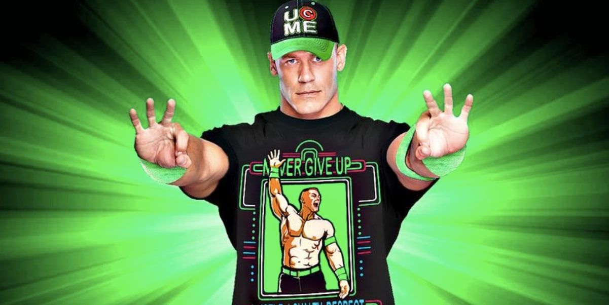
8 Green
He looked like a walking Starbucks, and the worst part was that the look was unveiled on the night of the biggest match of his career against The Rock at WrestleMania 28. It just didn’t really make any sense.
In the months following, Cena had one of the worst stretches of his entire career. Sure, the matches were pretty good, but he wasn’t exactly booked all too strongly. The green just didn’t go down well with us, and the same can be said for a lot of fans from that era.
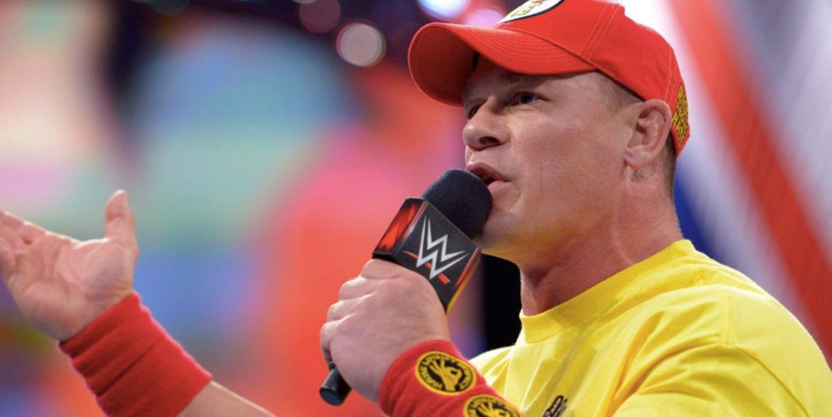
7 Yellow & Red
While John was featured in some important feuds and segments around this time, it just wasn’t a strong look and it made him look like a Hulk Hogan superfan more so than anything else.
Cena was getting to the age where it wasn’t really a logical look anymore for him, and while you could argue that it suits his persona regardless, that doesn’t really matter. If a specific look isn’t working for a character then it isn’t working, and it’s as simple as that. You can’t try and force it, no matter how hard you may want to.
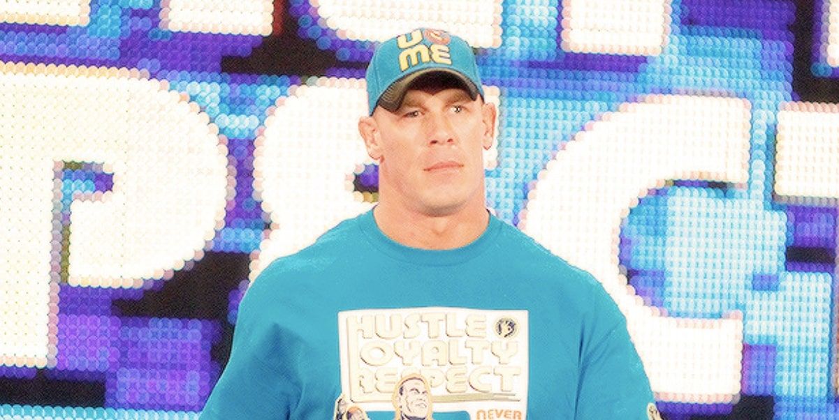
6 Light Blue
Now we’re really starting to get somewhere, starting off with a color scheme that just really seemed to suit Cena.
It wasn’t too in your face and it played into his history over on SmackDown. While he’s always been viewed as the sort of dominant figure that should probably spend most of his time over on RAW, as he has done for many years, we’ll always associate him with the blue brand as that’s where he was really able to cut his teeth before becoming a consistent main event star.
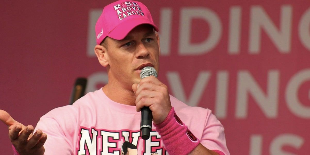
5 Pink
Real men wear pink and this is the living, breathing proof of that fact. Cena didn’t really wear the full pink strip on WWE programming all too often, and while his black and pink inverted look was cool, this is the one that really sends a message.
We can go back and forth about Susan G. Komen and whether or not WWE should really be in business with them all we want, but at the end of the day, Cena donning the pink in such a remarkable way really is great to see.
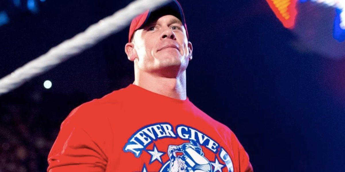
4 Red
After the purple he needed to come out strong, and boy oh boy did he accomplish that. The all red number, which made its debut at WrestleMania 27, seemed to signal the dawning of a new era for John Cena. It was almost like it was a warning sign to us of what was ahead – and what was ahead, as we all know, was the incredible two-year feud between Cena and The Rock which led to two Mania matches between them.
Oh, and this is the shirt Cena wore when he had that famous Money in the Bank title match against CM Punk.
3 Neon
It was really important for WWE to tell a good story in the build-up to Cena’s showdown with Bray Wyatt, and while one shirt isn’t capable of doing that, it gave off the right ‘subtle superhero’ type of look that balanced out the madness of Wyatt’s character pretty damn well.
It was a much more serious version of John Cena than we’d seen in quite some time, and heading into WrestleMania 30, that’s exactly what we needed to see. We aren’t always big fans of Cena in black, but some of his looks just work.
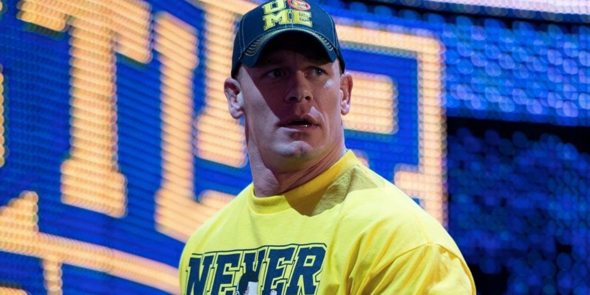
2 Yellow
He’d lost to The Rock in Miami one year prior, and in the weeks before the rematch at MetLife Stadium, John was looking stronger than ever before with a great yellow number that even looked a little bit golden – perhaps showcasing the sort of confidence John had in himself before the rematch went down.
It’s a very small part of the storytelling as we all know, but when it came to the ‘bold’ primary colors, this was the best option possible for John. He looked like a hero, which was so important at that stage of his career.
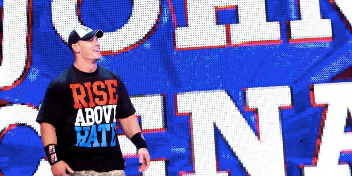
1 Rise Above Hate
No over the top color schemes, just one very simple message: Rise Above Hate. It was an idea that was born out of a storyline, but in reality, it wound up meaning oh so much more than that. Cena knew and still does know, just how many kids look up to him on a day to day basis. Giving them the knowledge that you can overcome just about anything in life is the whole point of his babyface character in the first place.
We own this top ourselves, and we’re proud to do so.

